Government of BC · via Deloitte · 2023
A portal for youth leaving care, designed with them.
For BC's Ministry of Children and Family Development, I designed SAJE: one place where young people transitioning out of government care can find their benefits, their plan, and help.
- Role
- UX/UI Designer, via Deloitte
- Client
- BC Ministry of Children and Family Development (MCFD)
- Users
- Youth and young adults formerly in care, frontline staff, MCFD
- Platforms
- Desktop and mobile web
- 45 hrsof user research, in workshops and 1:1 interviews
- 23people engaged across 3 user groups
- 5regions of BC: urban, rural and remote
- 15+subject matter experts, including trauma-informed design
The problem
Turning 19 shouldn't mean falling through the cracks.
When young people age out of government care, the supports they can get (education, housing, rent, transportation and financial help) are spread across programs, people and paperwork.
Youth often had to retell their story, didn't know where to start, and dropped off along the way. The research grouped what we heard into four themes.
- Theme 1Reducing barriers to accessFlexible, self-serve pathways to care, through more than one channel.
- Theme 2Engaging users effectivelyThoughtful design that builds trust and confidence, instead of anxiety.
- Theme 3Streamlining admin tasksLess paperwork for youth, and more time for frontline staff to connect.
- Theme 4Connecting the service ecosystemOne place for partners to coordinate, so there is "no wrong door".
The portal mission
“A tool that increases access to information, resources and supports, so former youth in care can create a healthy life for themselves.”
Design principles
Five principles, in the words of the people we heard from.
Every feature had to pass one test question per principle, like “Does this enable the user to make the choice that's right for them?”
- Autonomy“I feel in control”Tools to make my own decisions, in my own time.
- Efficiency“I feel focused”Help me prioritize what matters most.
- Clarity“I feel confident”Clear, timely information at every step.
- Flexibility“I feel understood”Support my diverse and changing needs.
- Accessibility“I feel empowered”Access what I need, without barriers.
The solution
SAJE: benefits, plans and help, in one place.
SAJE (Strengthening Abilities and Journeys of Empowerment) was named by youth who had been in care. The MVP gave them a single front door.
- Check eligibilityA few simple questions show which programs a young person qualifies for.
- Programs and benefitsEducation, career, transportation, financial and rental supports, explained plainly.
- Register in 3 stepsShort steps on mobile, with password rules shown up front.
- Ask a questionA simple contact form, with a clear promise: a reply within 3–5 business days.
- Help is always visibleThe 24/7 Helpline for Children and 9-1-1 sit on every page.
- Benefit remindersTimely nudges, like when it's time to apply for the rent supplement.
The ideal state
What if a plan felt like progress?
Apps like Duolingo, Nike Run Club and Fitbit keep people coming back with clear goals and rewards. I pitched the same idea for SAJE: the plan youth already had, turned into a journey they could see.
Each year is a level. Each goal has clear tasks with target dates. Complete a task, see it turn green, and move to the next step.
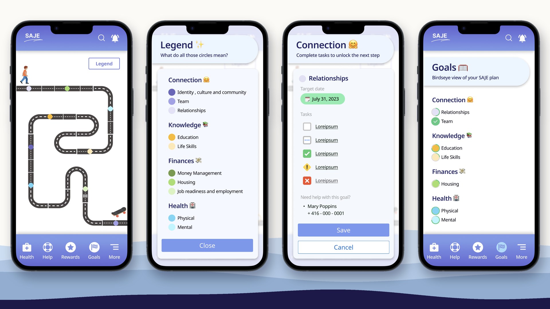
- MotivationClear goalsMilestones grouped into Connection, Knowledge, Finances and Health.
- ActionSimple tasksEach goal breaks down into tasks, in date order, with a named person to call for help.
- FeedbackVisible progressEvery finished task moves you along the road, so progress feels real.
How we got there…
Listen, map, test, deliver.
01 · Co-create
Designed with young people, not just for them.
17 co-creative sessions, including workshops with MCFD's Youth Advisory Council, the VACFSS Indigenous Youth Advisory Council and Foundry Prince George peer support workers, plus 15 interviews with the transformation team and frontline staff.
02 · Prioritize
Turned insights into a capability map.
We mapped every capability the portal could have, from eligibility to payments to community, and ranked each one by value to users against effort to build. The highest-value items shaped the MVP.
03 · Test
Tested two directions with youth.
Young people reviewed two concepts side by side. The welcoming spacing and youth-friendly language worked. They asked for more personalization, a notifications bar, clearer navigation, and a plainer name than “Eligibility Wizard”, which felt too magical.
04 · Deliver
Built design into the delivery process.
The project ran on 12 functional workshops and agile sprints. “Reviewed by the UX/UI designer” was part of the Definition of Done, so no feature shipped without a design check.
- 1Requirements walkthrough
- 2Confirmation
- 3Sign-off
- 4Product backlog
- 5Sprint
- 6UX review
Designing for people who need it most? Let's talk.