Mortgage, with RBC.
A Mortgage Options page with a direct path to RBC; Mortgage Hub guide: Learn → Estimate → Prepare → Explore.
Lives in: Mortgage Calculators
REALTOR.ca · Oct 2025 – Jul 2026
Led the team on creating 3 net-new revenue streams. Designed from zero, without destroying existing UX.
Shipped and live on www.realtor.ca
The problem
In January 2025, REALTOR.ca became its own company: a taxable subsidiary, still fully owned by CREA, with a mandate to find revenue beyond membership dues.
It had the audience. The catch: every new revenue surface had to live next to someone's home search journey without destroying trust, cluttering listing page, or competing with existing path to a REALTOR®.
Question that started it all…
“Where can new revenue-generating experiences live without hurting UX and overall flow?”
The solution
A Mortgage Options page with a direct path to RBC; Mortgage Hub guide: Learn → Estimate → Prepare → Explore.
Lives in: Mortgage Calculators
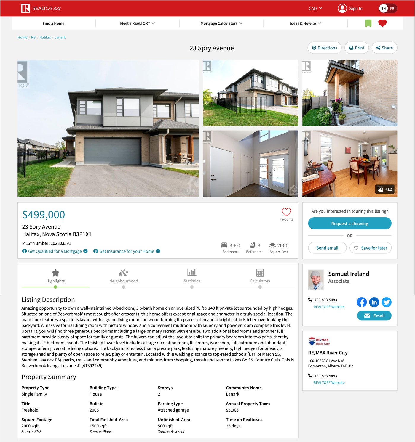
A bilingual TD Insurance CTA on every listing page, for residential and commercial properties.
Lives in: listing page, below the description
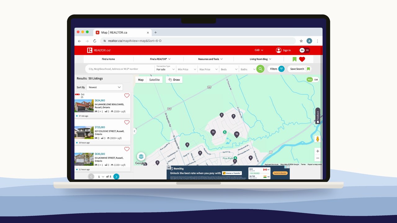
Ad placements across site's busiest surfaces. None of them existed before.
Lives in: homepage, map, listing page
Impact
How we got there…
01 · Discovery
Product wanted a full mortgage marketplace. We broke it into 5 phases, from an embedded rate with lead capture to a full lending marketplace. This allowed us to ship value early and learn before over-investing.
02 · Initial wireframing
70% of users drop off before scrolling past the first screen, so placement was the core decision. Insurance had to be visible without competing with the mortgage link, which earned more.
03 · Adapt
Mid-project, RBC acquired Pinch Financial, our multi-lender partner. The “compare many lenders” premise disappeared.
Instead of keeping a multi-step flow built for choice, my team pushed to remove the in-between page and send people straight to RBC.
Before
After
04 · Staying grounded
Both partners asked for custom buttons in their brand colours (RBC blue, TD green) with logos inside. We leaned back onto our branding guidelines: one-off branded buttons would look out of place and risk reading as spammy.
When TD said its logo was too small, we sized it to match the existing RBC logo and gave them options that met both their brand guide and ours.
Asked for
Buttons in each partner's own colours, logos inside, styled unlike anything else on the site.
Shipped
Standard design-system components, with partner logos sized consistently next to them.
05 · Iterate
My role
My role was strategy, alignment and quality control, not pixels. I coached my designers to have confidence, present to stakeholders. I also checked every claim we made to users for accuracy and inclusive language. Finally I stepped in hands-on when timelines got tight.
Looking back
Set up a shared metrics dashboard from day one. We iterated on live data, but it lived in meetings rather than in the team's documentation.
Building something that needs to earn and keep trust?