All case studies

REALTOR.ca · Oct 2025 – Jul 2026

Turning Canada's #1 real estate site into a revenue platform.

Led the team on creating 3 net-new revenue streams. Designed from zero, without destroying existing UX. 
Shipped and live on www.realtor.ca 

Role
Lead Product Designer
(player-coach)
Team
Jr. Product Designer, Product Designer, Sr. Graphic Designer
Partners
Product, Marketing, Legal, BSA, Engineering, RBC, TD Insurance
Platforms
Desktop + tablet + mobile Web;  Tablet + mobile App;
English + French
  • 633Mvisits in 2025
  • 2B+listing page views in 2025
  • #1real estate website in Canada
  • 3net-new revenue lines, all live

The problem

Huge audience and no real streams of income.

In 2025 REALTOR.ca became its own company, with a mandate to earn beyond membership dues.

The catch: every new revenue surface had to sit next to someone's home search without breaking trust.

Question that started it all…

“Where can new revenue-generating experiences live without hurting UX and overall flow?”

The solution

3 revenue streams, designed from zero, all live on www.realtor.ca 

Mortgage, with RBC.

A direct path to RBC, plus a Mortgage Hub guide.

Lives in: Mortgage Calculators

Insurance, with TD.

A bilingual TD Insurance link on every listing page.

Lives in: listing page, below the description
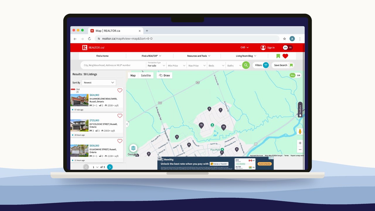
REALTOR.ca map search on a laptop, with an ad placement along the bottom of the map

Advertising, built in.

Ad spots on the busiest pages. None existed before.

Lives in: homepage, map, listing page

Impact

What it added up to.

  • 3net-new revenue lines, live on Canada's #1 real estate site.
  • 2national partners launched publicly: RBC (Jan 2026) and TD Insurance (Jul 2026).
  • 1step to the lender: we removed the in-between page from the hub to RBC.
  • ↑A stronger team.
    I coached my designers to be more confident in their skin and thinking process, throughout every step of this messy journey.

How we got there…

5 phases, from vision to real life.

  1. 01DiscoveryPhased the “big vision” into shippable steps.
  2. 02Initial wireframingPlaced revenue where it helped, not where it shouted.
  3. 03AdaptAdapted when the market moved: RBC acquired Pinch.
  4. 04Staying groundedProtected trust over partner branding.
  5. 05IterateShipped, measured, iterated.

01 · Discovery

Phased the “big vision” into shippable steps.

Product wanted a full mortgage marketplace. We shipped it in slices, learning before over-investing.

  1. 1MVPLink + lead capture on listings
  2. 2RBC pilotNative offer pageLive Jan 2026
  3. 3Compare lendersMulti-lender listReshaped
  4. 4Mortgage HubLearn → Estimate → Prepare → ExploreJun 2026
  5. 5MarketplaceFirst-party lendingFuture

02 · Initial wireframing

Placed revenue where it helped, not where it shouted.

70%

of people never scroll past the first screen. Placement was the decision.
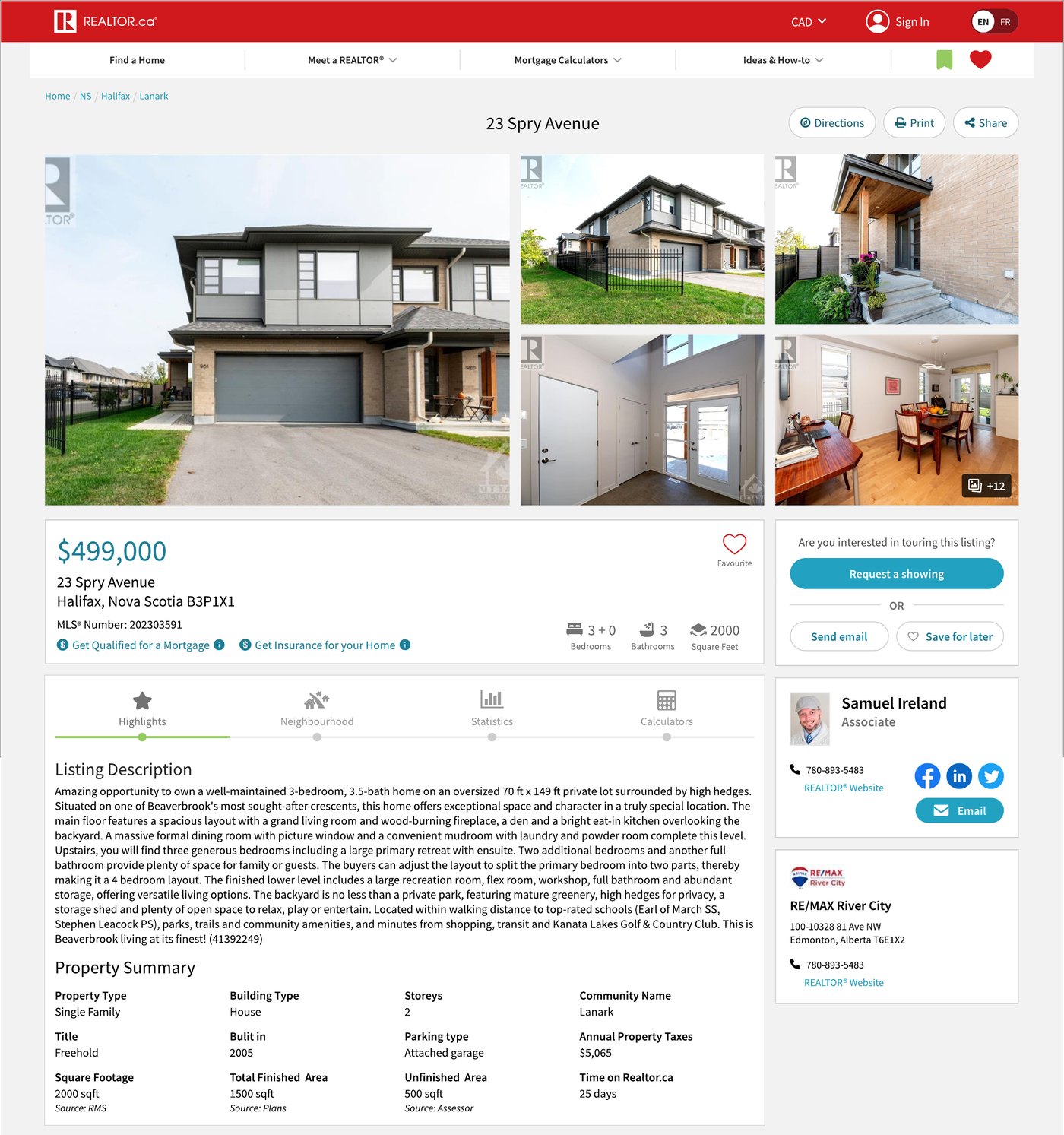
  • ANext to the price. Seen by all, but fights the mortgage link.
  • BBelow the description. Chosen. ~70% still see it; no fight.
A REALTOR.ca listing page, with two candidate spots for the insurance link marked: A next to the price, B below the listing description
Where the TD Insurance link could live on a listing page.

03 · Adapt

Adapted when the market moved.

RBC acquired Pinch, our multi-lender partner. A page built for choosing lenders no longer made sense, so we cut it.

Before · Feb 2026 MVP

Hub → choose a lender → RBC

After

Hub → RBC One step to the lender.

04 · Staying grounded

Protected trust over partner branding.

  • Asked for: buttons in RBC blue and TD green, logos inside.
  • Shipped: our own button for every partner. The logo carries the brand.

When TD said its logo was too small, we matched it to RBC's size and gave options that met both brand guides.

Partner = logo + offer. The button stays ours.
The design-system buttons every partner CTA uses.

05 · Iterate

Shipped, measured, iterated.

  • 3 test variations
  • v1.2 from exit-survey feedback
  • Unmoderated tests on usertesting.com

Before · v1

A “4.5%” in the hero read like a real rate offer.

After · v1.2

No fake rate. Offer, trust signals, then one button.
Weekly reviews. Marked up with Product, Marketing and Legal.
Explorations. Hero and partner-card options side by side.

My role

Leading through others.

  • Strategy, alignment and quality control
  • Coached my designers to present to stakeholders
  • Checked every user-facing claim for accuracy
  • Hands-on when timelines got tight

Looking back

What I'd do differently.

A shared metrics dashboard from day one. We iterated on live data, but it lived in meetings, not in the team's docs.

Building something that needs to earn and keep trust?